


 程序开发
程序开发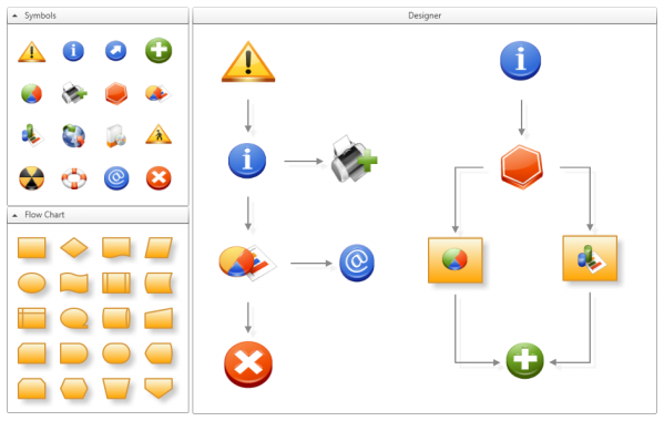
- Part 1 - Features: Drag, resize and rotate items on a canvas
- Part 2 - Features: Toolbox, drag & drop, rubberband selection
Introduction
There exist different techniques to connect items in a typical diagram designer. One approach is to provide connection elements in a toolbox which the user can drop on the designer canvas and then drag the endpoints to the source and sink items. Another approach is that the items themselves provide connection points from which the user can drag a connection to other items. This second strategy is the one I will explain in this article.
Use Case: How to Connect Items
I'm sure you know how to connect items in a designer application, but still I will illustrate this in some detail to make it easier to identify which class is involved in which activity.
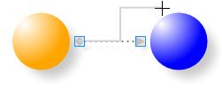
If you move your mouse over a designer item four visual elements of type Connector will appear at each side of the item. This default layout is defined in the ConnectorDecoratorTemplate and is part of the default DesignerItem template. Now move your mouse over one of the connectors and the cursor changes to a cross. |
 |
If you now click the left mouse button and start dragging, the connector will create an adorner of type ConnectorAdorner. This adorner is responsible for drawing the path between the source connector and the current mouse position. While dragging, the adorner continuously does hit-testing against the DesignerCanvas to check if the mouse is over a potential sink connector. |
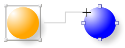 |
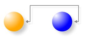
If you release the mouse button over a Connector element the ConnectorAdorner creates a new Connection instance and adds it to the designer canvas' children. If the mouse button is released elsewhere no Connection instance is created. |
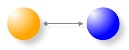 |
Like the DesignerItem the Connection implements the ISelectable interface. If a Connection instance is selected you will see two rectangles at each end of the connection path. They belong to an adorner of type ConnectionAdorner which automatically shows up when a Connection instance gets selected. Note: A ConnectorAdorner belongs to a Connector and a ConnectionAdorner belongs to a Connection. |
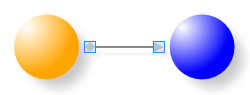 |
Each of the two rectangles represents a Thumb control and they are part of a ConnectionAdorner instance which allows you to modify existing connections. |
 |
| E.g. If you drag the sink thumb of the connection to another connector and release it there, you can re-connect the existing connection. Note: The ConnectorAdorner and the ConnectionAdorner are similar in what they do, but they differ in how they make use of an Adorner class. |
 |
How is a Connection Glued to an Item?
The default layout of the connectors is defined in the ConnectorDecoratorTemplate, which is part of the DesignerItem's template:
 <ControlTemplate x:Key="ConnectorDecoratorTemplate" TargetType="{x:Type Control}">
   <Grid Margin="-5">
     <s:Connector Orientation="Left" VerticalAlignment="Center"
            HorizontalAlignment="Left"/>
     <s:Connector Orientation="Top" VerticalAlignment="Top"
            HorizontalAlignment="Center"/>
     <s:Connector Orientation="Right" VerticalAlignment="Center"
            HorizontalAlignment="Right"/>
     <s:Connector Orientation="Bottom" VerticalAlignment="Bottom"
            HorizontalAlignment="Center"/>
   </Grid>
 </ControlTemplate>
A Connector class has a Position property which specifies the relative position of the connector's centre point to the designer canvas. Because the Connector class implements the INotifyPropertyChanged interface it can notify clients that a property value has changed. Now when a designer item changes its position or its size the connector's LayoutUpdated event is automatically fired as part of the WPF layout procedure. And this is when the Position property gets updated and itself fires an event to notify clients.
 public class Connector : Control, INotifyPropertyChanged
 {
     private Point position;
     public Point Position
     {
         get { return position; }
         set
         {
             if (position != value)
             {
                 position = value;
                 OnPropertyChanged("Position");
             }
         }
     }

       public Connector()
       {
           // fired when layout changes
           base.LayoutUpdated += new EventHandler(Connector_LayoutUpdated);
       }

       void Connector_LayoutUpdated(object sender, EventArgs e)
       {
           DesignerCanvas designer = GetDesignerCanvas(this);
           if (designer != null)
           {
               //get center position of this Connector relative to the DesignerCanvas
               this.Position = this.TransformToAncestor(designer).Transform
                    (new Point(this.Width / 2, this.Height / 2));
           }
       }

    ...

 }
Now we switch over to the Connection class. The Connection class has a Source and a Sink property, both of type Connector. When the source or sink connector is set we immediately register an event handler that listens to the PropertyChanged event of the connector.
  public class Connection : Control, ISelectable, INotifyPropertyChanged
  {
       private Connector source;
       public Connector Source
       {
           get
           {
               return source;
           }
           set
           {
               if (source != value)
               {
                   if (source != null)
                   {
                       source.PropertyChanged -=
                           new PropertyChangedEventHandler(OnConnectorPositionChanged);
                       source.Connections.Remove(this);
                   }

                   source = value;

                   if (source != null)
                   {
                       source.Connections.Add(this);
                       source.PropertyChanged +=
                           new PropertyChangedEventHandler(OnConnectorPositionChanged);
                   }

                   UpdatePathGeometry();
               }
           }
       }

      void OnConnectorPositionChanged(object sender, PropertyChangedEventArgs e)
      {
          if (e.PropertyName.Equals("Position"))
          {
              UpdatePathGeometry();
          }
      }

     ....

  }
This snippet shows only the source connector, but the sink connector works analogous. The event handler finally updates the connection path geometry, that's it.
Customize Connectors Layout
The default layout and the number of connectors may not always fit your needs. Take the following example of a triangle shaped Path with a customized DragThumbTemplate (see the previous article on how to customize the DragThumbTemplate).
 <Path IsHitTestVisible="False"
       Fill="Orange"
       Stretch="Fill"
       Data="M 0,10 5,0 10,10 Z">
   <s:DesignerItem.DragThumbTemplate>
      <ControlTemplate>
         <Path Fill="Transparent" Stretch="Fill"
                   Data="M 0,10 5,0 10,10 Z"/>
      </ControlTemplate>
   </s:DesignerItem.DragThumbTemplate>
</Path> 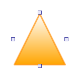
The problem here is that the connectors are only visible when the mouse is over the item. If you try to reach the connector on the left or right side you may have some problems. But the solution comes in the form of an attached property named DesignerItem.ConnectorDecoratorTemplate that lets you define custom templates for the connector decorator. The usage is best explained with an example:
 <Path IsHitTestVisible="False"
       Fill="Orange"
       Stretch="Fill"
       Data="M 0,10 5,0 10,10 Z">
   <!-- Custom DragThumb Template -->
   <s:DesignerItem.DragThumbTemplate>
      <ControlTemplate>
         <Path Fill="Transparent" Stretch="Fill"
               Data="M 0,10 5,0 10,10 Z"/>
      </ControlTemplate>
   <s:DesignerItem.DragThumbTemplate>
   <!-- Custom ConnectorDecorator Template -->
   <s:DesignerItem.ConnectorDecoratorTemplate>
       <ControlTemplate>
          <Grid Margin="0">
             <s:Connector Orientation="Top" HorizontalAlignment="Center"
                    VerticalAlignment="Top" />
             <s:Connector Orientation="Bottom"  HorizontalAlignment="Center"
                    VerticalAlignment="Bottom" />
             <UniformGrid Columns="2">
                <s:Connector Grid.Column="0" Orientation="Left" />
                <s:Connector Grid.Column="1" Orientation="Right"/>
             </UniformGrid>
          </Grid>
       </ControlTemplate>
    </s:DesignerItem.ConnectorDecoratorTemplate>
</Path> 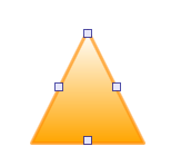
This solution provides a better result but it still needs some tricky layout, which may not always be feasible. For this I provide a RelativePositionPanel that allows you to position items relative to the bounds of the panel. The following example positions three buttons on a RelativePositionPanel by setting the RelativePosition property, which is an attached property.
 <c:RelativePositionPanel>
    <Button Content="TopLeft" c:RelativePositionPanel.RelativePosition="0,0"/>
    <Button Content="Center" c:RelativePositionPanel.RelativePosition="0.5,0.5"/>
    <Button Content="BottomRight" c:RelativePositionPanel.RelativePosition="1,1"/>
 </ControlTemplate>
This panel can be quite handy when it comes to arrange connectors:
 <Path IsHitTestVisible="False"
       Fill="Orange"
       Stretch="Fill"
       Data="M 9,2 11,7 17,7 12,10 14,15 9,12 4,15 6,10 1,7 7,7 Z">
   <!-- Custom DragThumb Template -->
   <s:DesignerItem.DragThumbTemplate>
      <ControlTemplate>
         <Path Fill="Transparent" Stretch="Fill"
               Data="M 9,2 11,7 17,7 12,10 14,15 9,12 4,15 6,10 1,7 7,7 Z"/>
      </ControlTemplate>
   </s:DesignerItem.DragThumbTemplate>
   <!-- Custom ConnectorDecorator Template -->
   <s:DesignerItem.ConnectorDecoratorTemplate>
       <ControlTemplate>
          <c:RelativePositionPanel Margin="-4">
             <s:Connector Orientation="Top"
                c:RelativePositionPanel.RelativePosition="0.5,0"/>
             <s:Connector Orientation="Left"
                c:RelativePositionPanel.RelativePosition="0,0.385"/>
             <s:Connector Orientation="Right"
                c:RelativePositionPanel.RelativePosition="1,0.385"/>
             <s:Connector Orientation="Bottom"
                c:RelativePositionPanel.RelativePosition="0.185,1"/>
             <s:Connector Orientation="Bottom"
                c:RelativePositionPanel.RelativePosition="0.815,1"/>
          </c:RelativePositionPanel>
       </ControlTemplate>
    </s:DesignerItem.ConnectorDecoratorTemplate>
</Path> 
Outlook
In the next article I will concentrate on commands:
- Cut, copy, paste
- Grouping of items
- Align items
- Z-ordering (bring to front, send to back,...)
History
- 24 February, 2008 -- Original version submitted
