1. Introduction
Who doesn't know the Outlook Navigation Pane on the left side of the Outlook screen? Do you want to use the Navigation Pane in your project for free? Read on.
2. Background
There is a lot of junk on the .NET market. Small study room projects being sold as large toolkits providing a bunch of crappy controls for a lot of money. To extend my portfolio and to give the open source community something back, I decided to make this control available free of charge. This control is also a note to control vendors, take your customers serious and provide valuable controls and support for their money. So enough preaching, let's get cracking.
Windows Form, the King is Dead??
I decided to create this control for Windows Forms to show the potential of Windows Forms. Windows Forms is not dead, because it performs betters and is responsive. WPF has a way to go. Besides that, you need a designer to design your controls, otherwise you'll end up with a Christmas tree.
3. Structure of the Navigation Pane
In this section, I'll briefly explain the basic objects of the Navigation Pane.

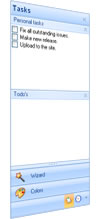
The Navigation Pane consist of bands, buttons and groups. The bands (2) are the basic object the Pane exists of. Each band is one to one linked to a button (1). The band is the container that comes to the front when the user clicks on one of the buttons. The band contains the other controls like the group (3). The bands can be expanded with groups which can be compared to the groups in Outlook. The Group is a control container which can be collapsed and expanded.
Button/Band
A button has three states, normal, when it's hovered by the mouse and when it's the active button or when the button is down.
A button is one to one linked to band. If a band appears as part of the control, a new button appears as well. It's not possible to add buttons without adding a band.
Group
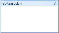
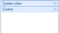
A group have two states, either it's expanded and all child controls are visible or it's collapsed and only the header is visible.
| expanded |
collapsed |
 |
 |
4. Layout
The main class of the control (NaviBar) contains barely more than two collections containing the buttons and the bands. The most important intelligence is in the layout classes. The only thing the main class does is deciding when the layout process should be invoked. This is the layout engine principle. Explained in more depth here on MSDN.

The layout process decides what control should be visible, active and at what position, etc. The advantage of this principle is that it’s really easy to implement a different layout without too much hassle, because the main control only knows that there is an layout but what it exactly does, he doesn't care either. As long as it looks nice, like the toolbox in Visual Studio or like the Navigation pane in Outlook, or some other fancy view.
Renderers and Colortable
Separate classes are responsible for drawing the controls. The main class delegates like a lazy manager. The renderers are only responsible for drawing the objects, the colours are coming from separate classes, the colortables. If you are in a good mood, you can use flashy bright colors with a few lines of coding:
 Collapse | Copy Code
 NaviButtonRenderer.ColorTable = FlashyColorTable
This elegant principle is ripped away from the default .NET menus which are coming with Visual Studio.
5. Features
Here is a brief list of the features. To see the whole package, see the demo project.
Collapse
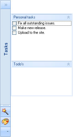
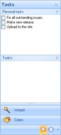
It’s possible to present the Navigation Pane in compact mode. Click on one of the small buttons on the top right of the header of the control. You can also collapse the Navigation Pane by setting the NaviBar.Collapsed property to true. If the end-user clicks on the collapsed bar, the band will popup on top of the other controls.
 |
 |
| Collapsed mode |
Expanded mod |
Layoutstyles
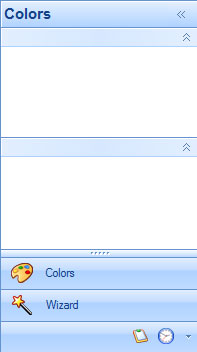
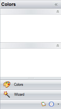
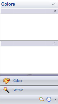
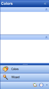
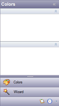
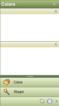
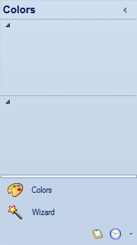
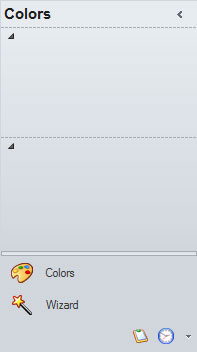
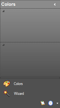
The Navigation Pane comes in six different flavors. Office 2007 is the main layout and for those who are stuck in the past, there is the Office 2003 look and feel. If you want to create a new colourstyle, you need to make an override of the NaviColorTable class.
 |
 |
 |
| Office 2007 Blue |
Office 2007 Black |
Office 2007 Silver |
 |
 |
 |
| Office 2003 Blue |
Office 2003 Silver |
Office 2003 Green |
 |
 |
 |
| Office 2010 Blue |
Office 2010 Silver |
Office 2010 Black |
Right to Left
This Navigation Pane is among the few who do support Right to left layout. Not much work when the layout has been defined in separate classes. It’s possible that not all features are like they should be. If one of the Arabics would like to test it and make me happy with the results?
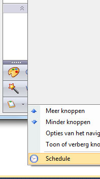
Flowing from the large buttons, to small buttons to menu items
When there is not enough space for the small overflow buttons, the buttons will appear as menuitems:
Saving Settings

It’s possible for the end user to customize the layout. Like the ordering of the buttons or the visibility of the buttons. It’s possible to save the layout settings in an external data file. The details which are saved are the ordering of the buttons, the visibility of the buttons, the amount of visible buttons, the position of the splitter and whether the Pane is collapsed or not.
The settings are stored in the Settings property in the NaviBar class. To save these settings to a file, add a reference to Guifreaks.NavigationBar.XmlSerializers.dll. This DLL uses XML Serialization and is generated with sgen.exe for performance considerations. You as a developer are responsible for saving the settings to a data file of your preference. Here is a sample of saving the settings to an XML file.
 Collapse | Copy Code
 if (saveFileDialogSettings.ShowDialog() == DialogResult.OK)
{
try
{
string fileName = saveFileDialogSettings.FileName;
NaviBarSettingsSerializer serial = new NaviBarSettingsSerializer();
using (TextWriter w = new StreamWriter(fileName))
{
serial.Serialize(w, naviBar1.Settings);
}
}
catch (Exception ex)
{
MessageBox.Show(ex.Message);
}
}
You can use the same DLL to load the settings. After loading the settings, use the ApplySettings method in the NaviBar class to activate the settings.
 Collapse | Copy Code
 if (openFileDialogSettings.ShowDialog() == DialogResult.OK)
{
try
{
string fileName = openFileDialogSettings.FileName;
NaviBarSettingsSerializer serial = new NaviBarSettingsSerializer();
using (StreamReader reader = new StreamReader(fileName))
{
NaviBarSettings settings = serial.Deserialize(reader) as NaviBarSettings;
if (settings != null)
{
naviBar1.Settings = settings;
naviBar1.ApplySettings();
}
}
}
catch (Exception ex)
{
MessageBox.Show(ex.Message);
}
}
Integration with Visual Studio
The integration with Visual Studio is mostly the one that comes at the end of the list, the one I rather forget. But it's very important. Integration with the document outline window for example. Other design time features are clicking on the button activates the band and brings it to the front.
Installer
The Control comes with an installer which automatically adds a tab and toolboxitems in Visual Studio. If you want to have an installable package, go to guifreaks.net.
6. Samples
Here are a few basic code samples that should get you up running fast.
How to Add a New Group?
While you are into the designer, you can select the group from the toolbox and drag it into the band. Here is a code sample when you want to add a group from the source:
 Collapse | Copy Code
NaviGroup group = new NaviGroup();

group.Text = "test";
group.Expanded = true;
group.Dock = DockStyle.Top;

naviBand3.Controls.Add(group);
How to Add a New Band?
You can add a new band to the Navigation Pane using the NaviBar.Bands property. The small image appears when the button is presented in a horizontal way on the bottom. The large image appears when the buttons are presented horizontally as large buttons.
 Collapse | Copy Code
NaviBand band = new NaviBand();
band.Text = "NaviBand" + (naviBar1.Bands.Count + 1).ToString();
band.SmallImage = Properties.Resources.bookmark1;
band.LargeImage = Properties.Resources.bookmark;
naviBar1.Bands.Add(band);
How to Set the Layout?
The layout can be set using the NaviBar.LayoutStyle property.
 Collapse | Copy Code
naviBar1.LayoutStyle = NaviLayoutStyle.Office2003Silver;
How to Activate a Band?
Making a particular band the active band is fairly simple:
 Collapse | Copy Code
naviBar1.ActiveBand = naviBar1.Bands[0];
Releases
I recommend using the latest release and the installer.
The latest releases installer and source code can be found at http://www.guifreaks.net.
History
- 13 November, 2010: Updated article to latest version
- 21 October, 2009: Added a Visual Basic .NET sample project
- 20 October, 2009: Article CodeProject
- 16 October, 2009: Initial release
I design software for a ERP software vendor in the Netherlands.
For more information, the latest version installer etc goto guifreaks.net

